Some are flirty, some are bold, some are fun, and some are unbearably boring. In the advertising world, typefaces are essential to a design, and the way letters curve or meet can make or break the entire composition. Design and art publisher It’s Nice That recently held a live global session examining the importance of type and lettering and how to make type talk.
Letterforms and typefaces are a universal language.
Across the pond in London, award-winning graphic designer Caterina Bianchini of Studio Nari kicked off the event by talking about her experience working with different letterforms and their unique personalities. Working with letters and typefaces is called typography. Typography is the art of arranging certain words or letterforms to convey a message or an idea to the audience (Academy of Art University).
Designers from all over the world tuned in to learn more about this fundamental design element and how to incorporate emotion into different compositions. Almost 200 people, from novice designers to well-established agency owners, sat in excitement as Caterina prompted all the attendees to test out the power of typefaces themselves. Given words like unity, change and rise, each attendee created a type poster in ten minutes. Using only color and letters, how could they convey the right message or tone?

(Source: Unsplash.com. Photographed by Brett Jordan)
So what makes letters so special?
In the design world, each letter has its own personality and naturally, we like some more than others. A is one of my favorites because it’s simple, straight-to-the-point and easy to understand. J is predictable no matter how hard it tries not to be, and G has become overwhelming to work with because it demands all the attention all the time. Of course some letters are harder to work with than others, but as a foundational element of design, mastering how to manipulate and work with all letters is vital.
During the live session, there was a unanimous decision that the letter Q is one of the toughest letters in design because it can be so intricate and it demands a lot of room. Es, Ls and Cs were among the favorites because they are always easy to point out and read. The way letters curve, come to a point, extend or even sit next to one another can disrupt the balance of a composition, causing the message or idea to get lost in translation. So how do you avoid that? Well, you simply choose typefaces that are readable, spaced evenly, attractive and match the personality of your brand or idea (Academy of Art University).

(Source: Unsplash.com. Photographed by Jeroen den Otter)
Using Jokerman, Apple Chancery or Comic Sans is never a good idea.
The relationship between letters sets the foundation for every typeface. Some are good and some are bad, like really, really bad. Infamous typefaces like Jokerman, Apple Chancery and Comic Sans are the latter. Filled with inconsistencies and disproportionalities, these typefaces are a nightmare for designers and an unpleasant experience for the audience. In order to grab the attention of the reader and properly convey a message there needs to be consistency, balance and most importantly, legibility.
It’s Nice That recently published a quick two-minute read emphasizing the importance of matching your font to your brand. The article introduces graphic designer Victor Bartis and art director Christian Costea, creators of Font Brief, an online discovery tool that outlines every attribute of over 300 fonts. The website filters fonts by personality, size and weight, doing most of the legwork for you.
Ten-minute type masterpieces.
All the attendees shared their designs, and they were mind-blowing to say the least. It was amazing to see how differently everyone interpreted the brief and how they conveyed their message or word.
Here are a few examples:
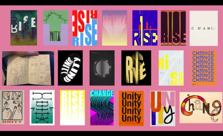
(Source: screenshot of It’s Nice That Live Session with Caterina Bianchini of Studio Nari)
It was a great experience and as a graphic designer student, I really appreciated all the advice from Caterina and the It’s Nice That team. Check out their upcoming live sessions for more amazing tutorials and guest speakers.