Instead of starting off this blog with doom and gloom, we’re going to be empowering, proactive, and enlightening about an issue that many people encounter on a daily basis: Dark Patterns.
No, we’re not talking about airplanes (those are holding patterns) or desserts (that’s dark chocolate, now I’m hungry). Dark patterns are website designs and setups that are focused on getting a consumer to take actions they never intended to take. Hidden subscriptions or fees, false scarcity, obstruction and preselection are some of the biggest dark patterns to emerge over the past few years, and I’m going to walk through what to look for and how to avoid falling into their traps.
First, a little history
One of my favorite books to re-read over the years is Influence: The Psychology of Persuasion, written by Robert B Cialdini, Ph.D.—something I first read when I took a class at Rowan University specifically for persuasion and social influence, with the goal of understanding consumer behaviors and how to properly market and advertise to people, ethically.
The book does a great job of breaking down all of the core principles of persuasion (reciprocation, commitment and consistency, social proof, liking, authority, scarcity, and unity) and like myself, millions of people around the world have read and incorporated these principles into their work since it was first published in 1984. That being said, more than a few people in this world have shadier motives in an effort to grow sales, increase revenue, or get people to like them more. In the physical world, there’s a ton of factors at play that can make or break a persuasion strategy, and this book is a great way to arm yourself from the negatives.
In the digital world, things are a lot less clear cut. When I grew up using AOL Instant Messenger, we were told not to use our real name, don’t put a phone number or address anywhere, and don’t go into chat rooms that were unfamiliar. Anonymity was standard, but companies knew that if they could just crack the code to get people to fill out personal information, the world would change forever. Cue social media, where people were shunned as “keyboard warriors” for hiding behind “fake profiles.” People not using their real names are now considered weird or strange, and companies are now reaping the benefits of that societal shift.
While the intentions were initially good—identity verification so someone could know they were talking to the real John Smith they grew up with and not some creep on the internet—the data collection that came with it spurred a massive movement to keep that data flowing. This didn’t take arm twisting or complicated sales tricks, this was all done out in the open before our eyes, without us consciously knowing it.
Fast forward to the 2020s. Global pandemic, everything’s going digital. Social media companies are starting to top out in consumer growth, and they need to find new ways to generate revenue for their shareholders.
Cue dark patterns.
Are you sure you want that?
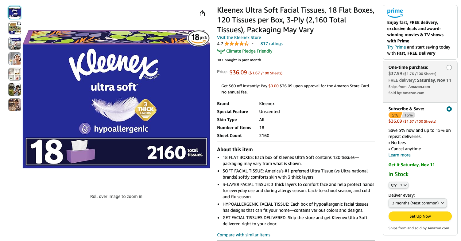
Amazon, purveyors of pretty much everything these days, have unsurprisingly become purveyors of some of the worst dark patterns developed at the time of this blog. In the example below, we’re going to call out one of their most famous dark patterns, preselection:

Preselection involves a website choosing a path for the consumer without the consumer’s input, often to drive a specific action. In this instance, on the far right side, Amazon wants me to “Subscribe and Save” at a lower price, and has preselected that. If I choose “one-time purchase,” the price goes up to $37.99.
Sure, it’s a dollar less, but if they can secure that recurring revenue even once, they’ve increased their revenue to $72, when the consumer only intended to spend $36. Multiply that across the millions of people that buy on Amazon, and one could see how they stand to profit from that dark pattern.
Amazon is also notorious for making it difficult to leave their subscription service, and in turn, has led the way for many other companies to design similar experiences in a bid to save customers from leaving, or churning.
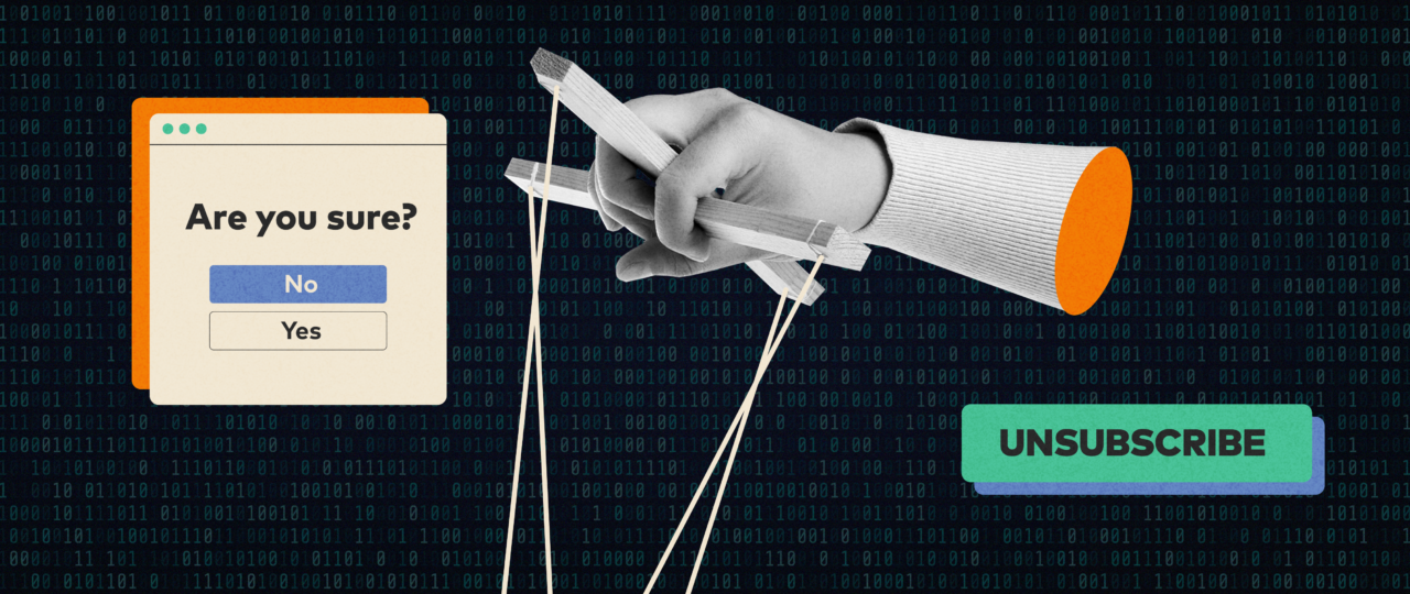
An example from Deceptive Patterns, a website dedicated to warning consumers about dark patterns, shows how the New York Times (NYT) makes it super easy to sign up for a subscription, but painfully hard to get rid of it. For all the fuss about GDPR (we have a whole blog on privacy in digital advertising for more info), one big aspect is preventing consumers from having a hard time unsubscribing from content. The dark pattern’s aim here is that a consumer will give up trying to unsubscribe from the platform and just keep the subscription. For Amazon, their subscription is $15 a month (in 2023), and might not be something worth fussing over. For NYT, it gets even darker. They advertise $1 per week for the first six months, which then rises to $25 a month until someone cancels. The delayed punch to a credit card is jolting, especially if the fine print is skipped.
Limited time liars
False scarcity has been around for ages, and tends to be one of the more powerful drivers for dark patterns on the web. In ancient times, if we called in the next hour, we could get twice as many gizmos and gadgets for free, and all we had to do was pay shipping! What the infomercials didn’t tell us was that those ads ran for months on end, there was no timeout associated with the deal, and the shipping and handling was often the full price of the product package. It was reminiscent of a bait-and-switch, only without the bigger price tag.
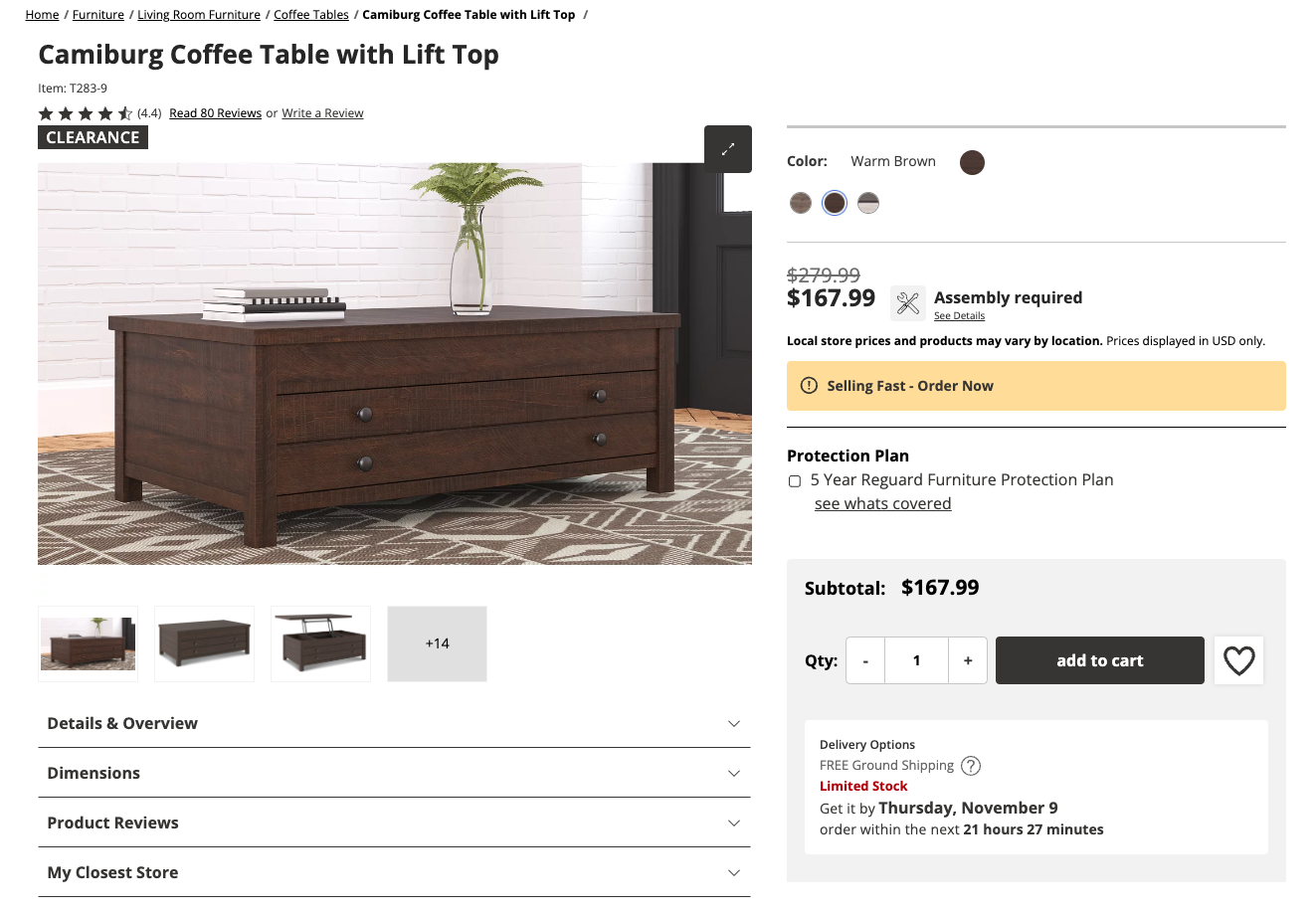
In the digital world, furniture stores love a good false scarcity tactic, especially with items they want to move on clearance. In the example below, see if you can point out the markers that qualify for this dark pattern.

Not only does it mention “Selling Fast – Order Now,” but it also mentions “Limited Stock” in the bottom right, just below the mention of free shipping. This tactic employs fake urgency, with the time limit in that bottom right corner implying that if the deal isn’t taken, it will expire. The truth behind many false scarcity/fake urgency dark patterns is that these can all be coded within a website’s HTML, which can set a timer, or a set number of items, that way the consumer is tricked into thinking there’s less than there actually are. It might honestly be genuine, for example, if there’s only a few watermelons left at a local grocery store, but there’s a good chance the items may still have a hefty amount of stock remaining. They’re just trying to move it for a price that pads their pockets. Shameless.
Stay skeptical
To tie this back to advertising, because I want every business owner to succeed, Google and Meta (owners of Facebook) have begun to scrape the bottom of the barrel to get advertisers to spend as much money as possible on their platforms. Both platforms have seen a plateau in consumers, and a greater number of lawsuits and regulations tying up their record profits. How can they negate those fines? Dark patterns!
Google introduced their “optimization score” years ago, and while it does offer some tips on how to properly deliver ads within their ecosystem, the truth is that rejecting their recommendations can increase that optimization score. Yes, that’s correct—simply select “no thanks” and the optimization score will eventually go to 100%. It is a deep-seeded dark pattern designed to get advertisers to follow a strict set of rules that may (or may not, in rare cases) put more money in Google’s pocket.
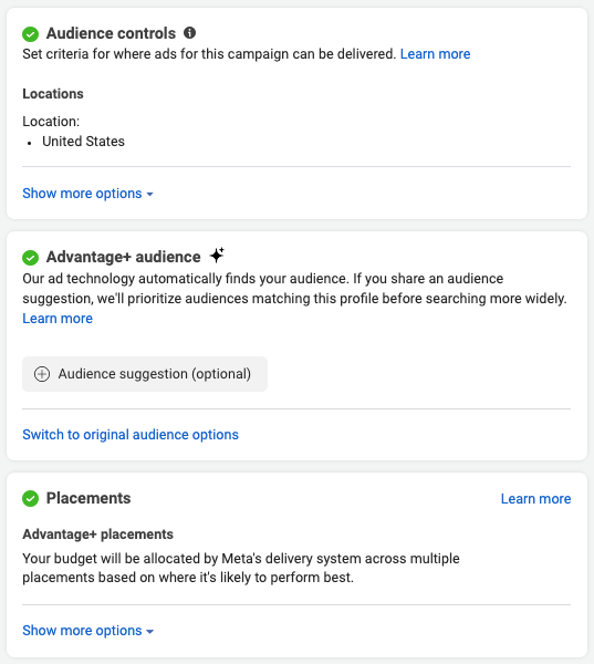
Now Meta is toying with this same method, introducing “recommended optimizations” that are turned on by default, and by late 2023, they’ve hinted at getting rid of interest and behavior targeting all together, forcing advertisers to rely on their “Advantage+” targeting by default.

Here we have a bunch of preselections and obstructions designed to separate the advertiser from their money in the fastest way possible. Green check marks imply that the decisions are correct, and they’ve removed any visible indications that advertisers can change these options, outside of “show more options” or “switch to original audience options.” While Meta is claiming they’re prioritizing placements, locations, and audience matching for performance, turning it all into a black box absolves them from any issues should the system turn out results that are less than desirable. If someone can’t see how big an audience is, how can someone complain that they didn’t reach a certain goal? This will help Meta boost products that increase profit for them, and decrease return on investment for advertisers. There’s a reason why the “right column” ad placement on Facebook still exists after ten years, despite it driving the lowest impact of any placement.
Stay vigilant
Whether it’s Black Friday sales, moving to a new town and shopping for furniture, or trying to put down a few dollars to scoop new customers for a side business, dark patterns are everywhere. The more prepared we are to beat companies at their own games and protect our money, the more those ethical companies we choose to work with and buy from will rise to prominence. Always be skeptical of a deal, always think twice before subscribing, and most of all, do some research before making that purchase. Double and triple checking can save tons in the long run! Lastly, if you’re designing a website or ad campaign for your business, feel free to reach out to ChatterBlast for smart, ethical ways to land new customers and grow your revenue!


